Visual Editing
Visual editing lets you select and modify elements directly on the live preview — no prompts, no code, no credits. Use the Edit / Preview toggle in the top bar to switch between modes.
Visual editing lets you select and modify elements directly on the live preview — no prompts, no code, no credits. Use the Edit / Preview toggle in the top bar to switch between modes.
Edit Mode
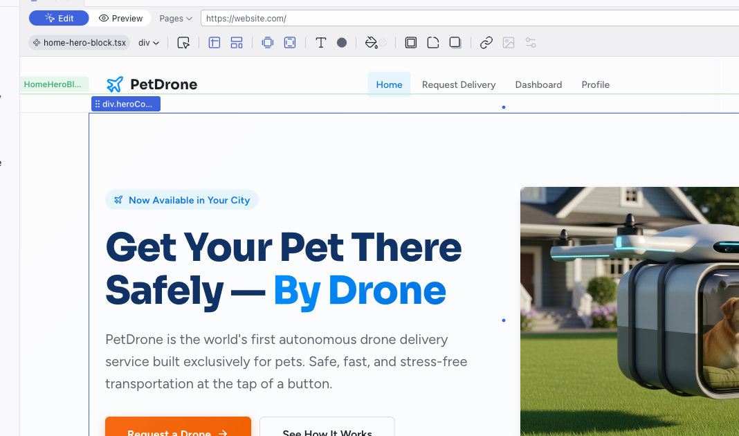
In Edit mode, clicking selects elements for editing. A selected element shows:
- Blue outline with drag handles at corners and edges
- Green outline around the parent component
- Breadcrumb label showing the component name (e.g., "HomeHero...")
- Arrow to drill into the component's inner scope
Double-click to drill into a component, or hold Cmd (Mac) / Ctrl (Windows) and click to select any deeply nested element directly. Whatever you select is sent to the AI as context.
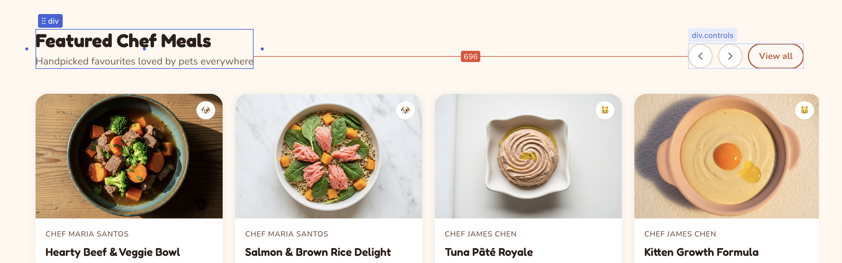
Hold Alt and hover over another element to see pixel distances between the selected element and the hovered one. Distance lines with labels appear as an overlay.
Direct editing:
- Text — double-click any text element to edit it inline
- Images — double-click any image to open the Media panel
- Icons — double-click any SVG icon to browse the Lucide icon library for a replacement
- Drag — click and drag a selected element to reorder it, move it into sibling containers within the same scope, or reposition it on the page. You can also drag images, icons, and HTML elements from the Add Panel onto the preview to place them into components.
Every visual change is immediately written to the source code. When you edit in a mobile viewport (using the Responsive buttons in the top bar), changes are applied through a CSS media query so they only affect the mobile layout.
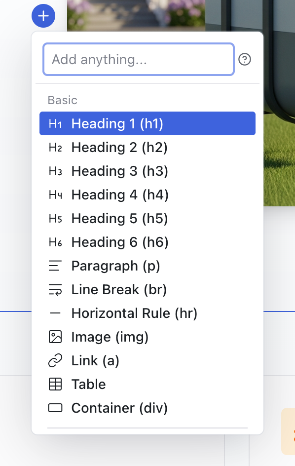
Quick Insert Buttons
When you select a component, quick insert buttons appear above and below it on the stage. Click one to open the element picker, where you can search or browse categorized HTML elements (headings, images, forms, containers, and more) alongside add-ons. The AI generates the chosen element based on the surrounding context and inserts it at that position.
The Editing Toolbar
The Editing Toolbar appears below the top bar when an element is selected and Edit mode is active. Click any control to expand its panel. Changes take effect immediately and are written directly to the source code.

Some controls are disabled when they don't apply to the selected element. For example, Media is only active when an image is selected.
File Breadcrumb and Component Name
The left side of the toolbar shows the file breadcrumb (e.g., home.tsx) and the component name (e.g., HomeHeroBlock). This tells you exactly which file and component the selected element belongs to.
Element States
Toggle pseudo-states to style how an element looks when a user interacts with it:
- Hover — when the cursor is over the element
- Active — while the element is being clicked
- Focus — when the element has keyboard focus
- Focus visible — keyboard focus with a visible indicator
- Focus within — when a child element has focus
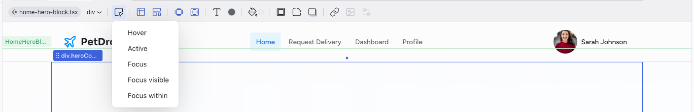
You can enable multiple states at once to preview combined interactions.
Size and Position
Set explicit dimensions and positioning for the selected element.
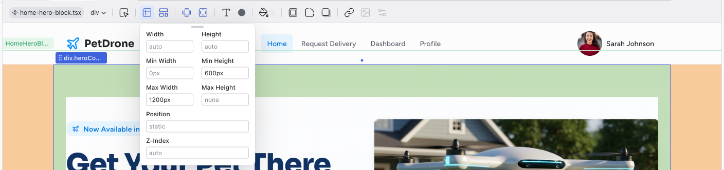
- Width / Height — set exact values or leave as
auto - Min / Max Width and Height — constrain how the element scales
- Position — set the CSS position (e.g.,
relative,absolute,fixed) - Top / Right / Bottom / Left — offset values when using positioned layout
- Z-Index — control stacking order
Layout
Choose a layout mode for container elements. The Presets tab offers common patterns, while the Custom tab gives you full control over flexbox and grid properties.
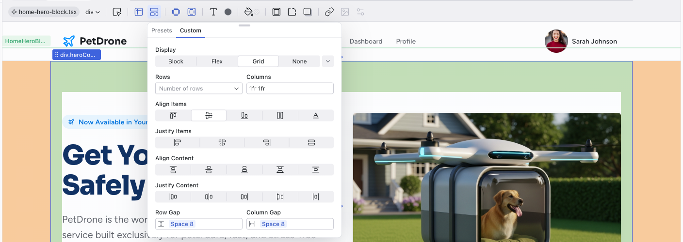
Available presets:
- Box — a basic container
- Horizontal Stack — flex row
- Vertical Stack — flex column
- 2x2 Grid / 3x3 Grid — CSS grid layouts
- None — remove layout
Margin
Control the outer spacing around the selected element. The visual editor shows four fields arranged around a cross — top, right, bottom, left — so you can see which side you're adjusting. You can edit each side independently, or use the triggers inside the controller to edit in pairs (top and bottom, right and left) or all four sides at once.
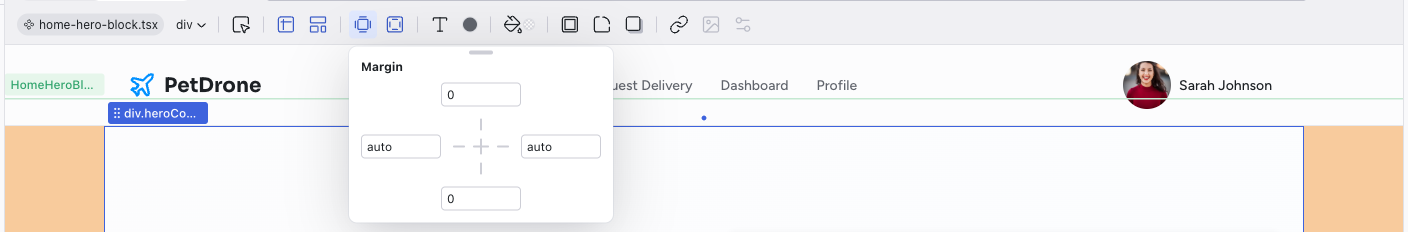
You can also adjust margins directly on the canvas. When you hover over the outer edge of a selected element's selection frame, orange drag handles appear that let you change the margin by dragging. A tooltip displays the original source value (e.g., 2rem or --space-5) as you drag, rather than the computed pixel value. Hold Alt while dragging to edit opposite sides together, or Shift to edit all four sides at once. A tooltip at the top of the viewport shows the available modifier keys when you start dragging.
Vertical margin handles don't appear on inline elements, where top and bottom margins have no effect.
Padding
Control the inner spacing inside the selected element. Same layout as Margin — four directional fields around a center point, with the same options to edit sides independently, in pairs, or all at once.
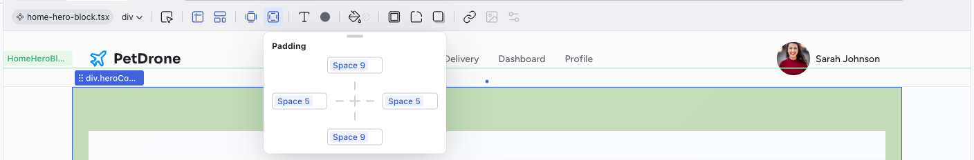
Padding can also be adjusted directly on the canvas using green drag handles that appear when hovering over the inner edges of the selection frame. The same modifier keys apply: hold Alt for opposite sides, Shift for all sides.
Typography
A comprehensive set of text controls. The dropdown at the top lets you pick from font presets defined in your theme, which keeps typography consistent with your design system.
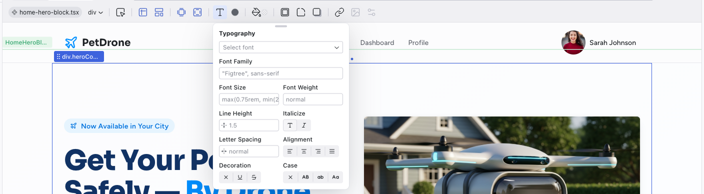
- Select font — choose from theme font presets
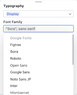
- Font Family — the CSS font-family value. The dropdown includes Google Fonts (Figtree, Sora, Roboto, Inter, Montserrat, and many more) alongside your theme's generic font stacks, so you can browse and apply web fonts directly.
- Font Size / Font Weight — size and boldness
- Line Height — spacing between lines
- Italicize — toggle italic style
- Letter Spacing — tracking between characters
- Alignment — left, center, right, or justify
- Decoration — underline, strikethrough, or overline
- Case — uppercase, lowercase, capitalize, or normal
Text Color
Pick a text color using one of three tabs:
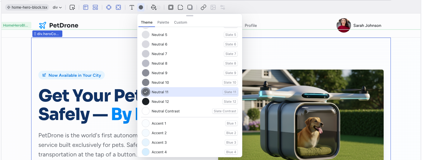
- Theme — your project's semantic design tokens, organized by group (Neutral, Accent, Error, Success, Warm, Warning). Each group shows 12 graded colors plus a 13th Contrast swatch — a white or black that looks good against the group's colors. The current color is indicated with a checkmark. Using token colors keeps your project visually consistent and responsive to theme changes.
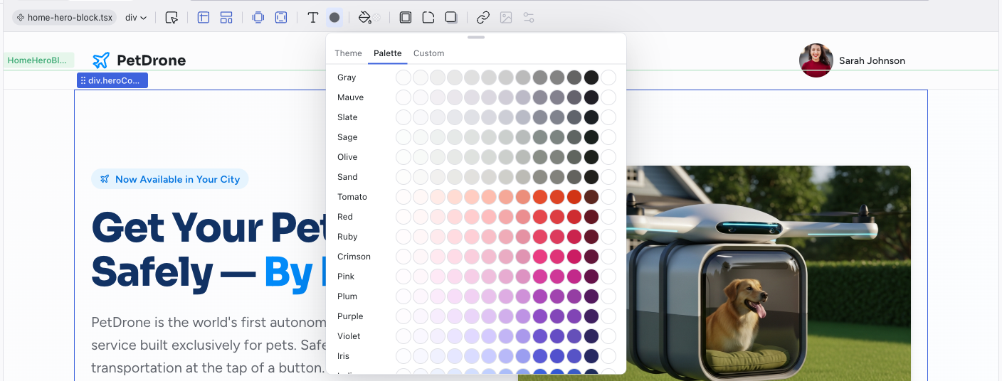
- Palette — a broader color palette with every available color family (Gray, Mauve, Slate, Tomato, Red, Blue, Green, and many more). Each family shows 12 graded colors plus a Contrast swatch as a row, making it easy to explore colors outside your theme tokens.
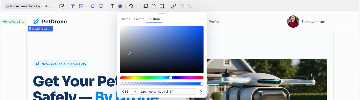
- Custom — a freeform color picker with a saturation/lightness gradient area, hue slider, opacity slider, format dropdown (CSS, HEX, RGB, HSL), and a value input field. An eyedropper tool lets you sample colors from anywhere on screen.
Background
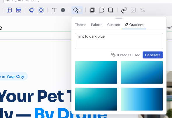
Set a background color or gradient. The first three tabs work the same as Text Color, with an additional Gradient tab.
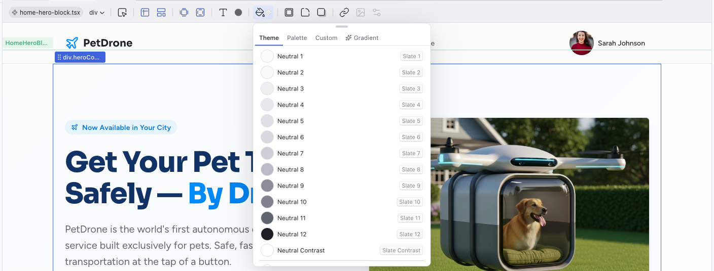
Four tabs:
- Theme — semantic token colors (same as Text Color)
- Palette — broader color palette (same as Text Color)
- Custom — freeform color picker (same as Text Color)
- Gradient — describe a gradient in natural language (e.g., "mint to dark blue", "warm sunrise", "vibrant pattern") and the AI generates it. This uses credits.
Border
Choose a border style for the selected element. Options include no border, solid, dashed, and dotted lines. When a border style is selected, additional controls appear for width and color.

Corners
Set the border-radius using your theme's radius scale. This keeps corner rounding consistent across your project.
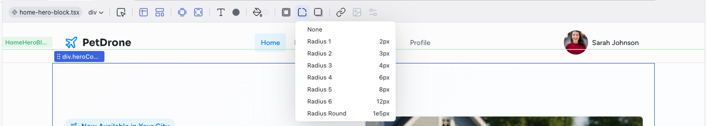
The scale ranges from Radius 1 (2px) for subtle rounding to Radius Round for fully circular corners (like avatar images or pill-shaped buttons).
Shadow
Add depth with box shadows. Choose from preset shadow levels or inner shadows.
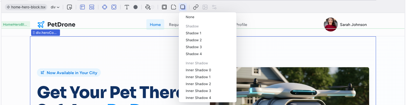
- Shadow 1–4 — increasingly prominent outer shadows
- Inner Shadow 0–4 — inset shadows for recessed effects
Link
Configure where an element links to. The panel has four tabs for different link types:
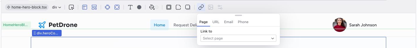
- Page — link to another page in your project
- URL — link to an external URL
- Email — create a
mailto:link - Phone — create a
tel:link
Media
The Media control activates when you select an image element. It opens the Media panel where you can browse, replace, upload, and generate images.
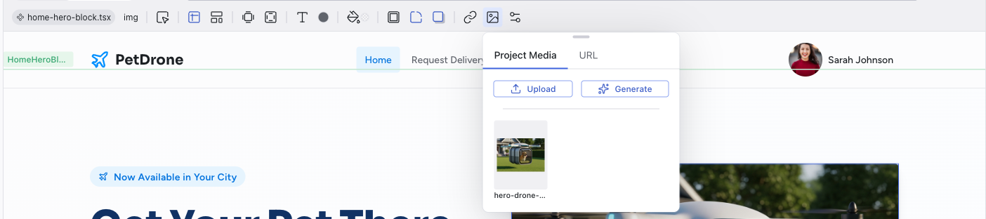
The panel has two tabs:
- Project Media — shows all images currently in your project. Click any thumbnail to use it. You can also Upload a new image from your computer or Generate a new one with AI (see below).
- URL — enter a URL to use an externally hosted image (from a CDN, design tool, or any public URL)
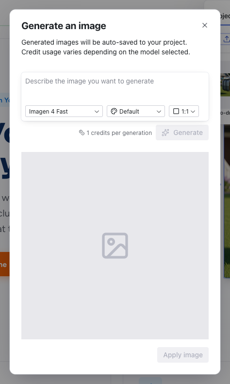
Clicking Generate opens a modal where you describe the image you want. You can choose the AI model, style, and aspect ratio. Generated images are auto-saved to your project.
Double-clicking an image in the preview also opens the Media panel directly.
See Media for the full feature reference.
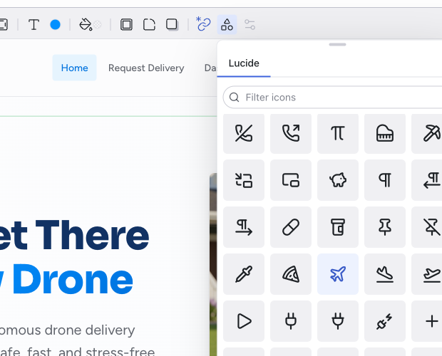
SVG Element
The SVG Element control appears when you select an SVG element (such as an icon). It replaces the Media control in the toolbar. Double-clicking an SVG element in the preview also opens this panel directly.
The panel lets you browse the Lucide icon library and replace the selected icon with a different one.
Properties
The Properties panel shows the React component props for the selected element. This is available when you've drilled into a component's inner scope and selected an element that has configurable props.
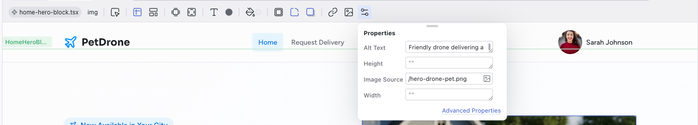
The Advanced Properties link opens a more detailed view for complex prop configurations.
Related Articles
- Visual Editing – guide to visual editing workflows
- Styling Element States – editing hover, focus, and active states
- Working with the Theme – customize colors and typography at the project level
- Media – full reference for the Media panel