AI Buttons
Save reusable AI prompts as buttons that you can trigger from the action bar or the right-click context menu.
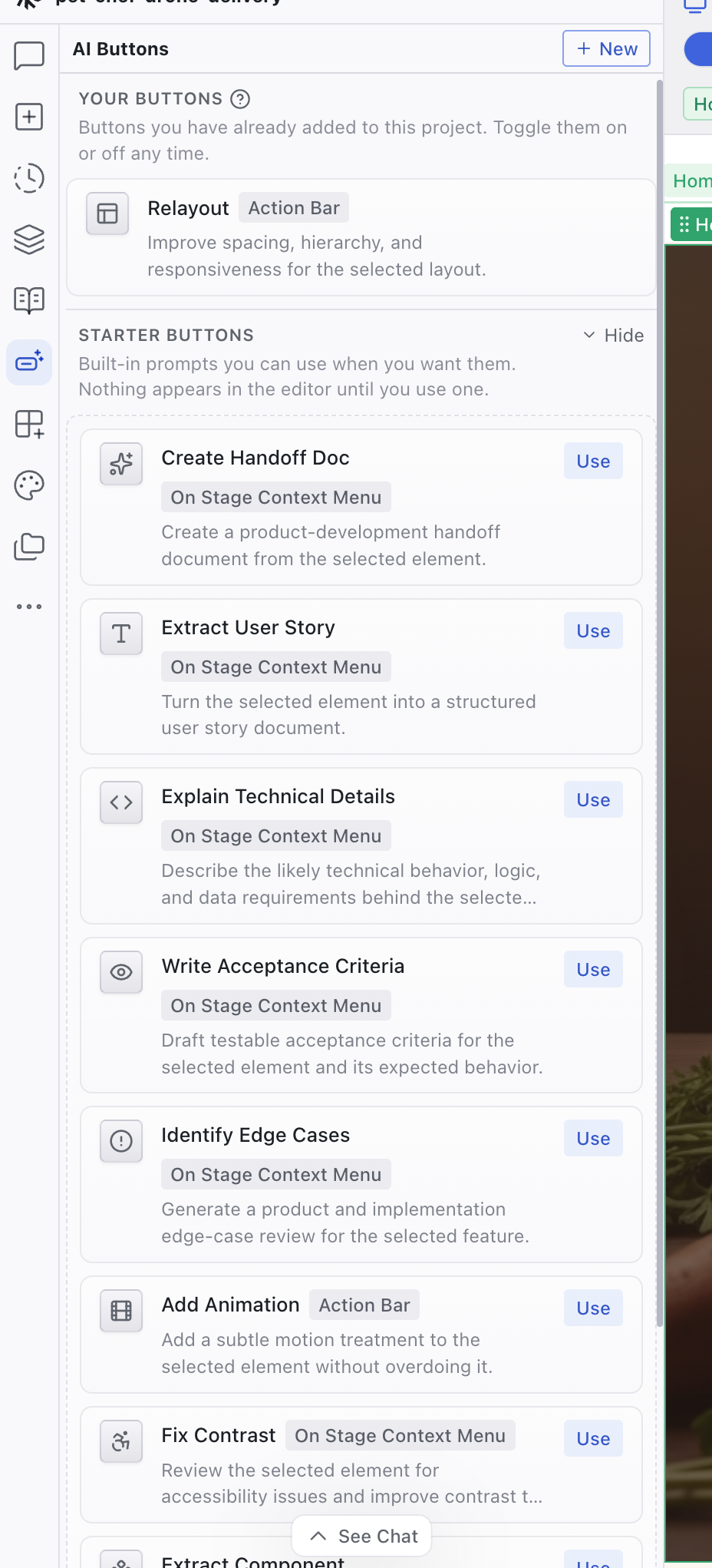
The AI Buttons panel lets you save reusable AI prompts as buttons. Define what the AI should do, choose where the button appears, and run it on demand. This is useful for actions you repeat often, such as generating a handoff document, extracting user stories, or running an accessibility audit on a selected element. Buttons are saved per project.
The AI Buttons Panel
The AI Buttons panel is a tab in the left sidebar. It starts unpinned by default. Open the Organize panels menu (the ellipsis icon at the bottom of the tab rail) and pin it to add it to the sidebar.
The panel has two sections:
- Your Buttons: buttons you've added to this project. Toggle them on or off at any time.
- Starter Buttons: built-in templates you can add with one click. They cover common workflows like creating handoff documents, extracting user stories, writing acceptance criteria, and identifying edge cases.
Creating a Button
Click + New at the top of the panel to open the button editor. Click an existing button to edit it. The same dialog is used for both.
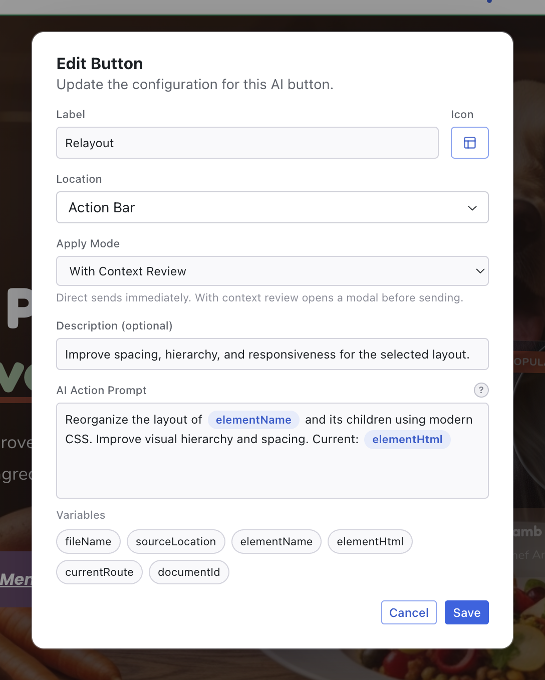
| Field | Description |
|---|---|
| Label | The button name shown in the panel and in the editor |
| Icon | An icon from a curated set |
| Location | Where the button appears: Action Bar (visible when you select an element) or Context Menu (when you right-click an element). Both require Edit mode. |
| Apply Mode | Direct sends the prompt immediately. With Context Review opens a dialog first so you can review how variables resolved and add context before sending. |
| Description | Optional longer text shown in the panel and sent to the AI as additional context |
| AI Action Prompt | The prompt the AI receives when you click the button |
Template Variables
The prompt can include template variables that resolve to the current state of the editor. Wrap them in double curly braces:
| Variable | Description |
|---|---|
{{elementName}} | The name of the selected element or component |
{{elementHtml}} | The rendered HTML of the selected element |
{{sourceLocation}} | The file path and location of the selected element's source code |
{{fileName}} | The name of the active file |
{{currentRoute}} | The page route currently shown in the preview |
{{documentId}} | The project's document identifier |
For example, a prompt like "Write acceptance criteria for {{elementName}} on {{currentRoute}}" resolves to the actual element and page before the AI sees it.
Running a Button
Where you trigger a button depends on its Location setting:
- Action Bar: the button appears in the action bar when you select an element
- Context Menu: the button appears when you right-click an element
Both locations require Edit mode, since there's no element selection in Preview mode.
If the apply mode is With Context Review, a dialog shows the resolved prompt and any attached context before sending.
Managing Buttons
Each button in the Your Buttons section can be toggled on or off, duplicated, edited, or deleted.
Related Articles
- Chat-Driven Editing – working with the AI through the Chat panel
- Chat – the Chat panel reference
- The Editor Layout – overview of the editor workspace
Chat
The Chat panel is the primary interface for working with the AI. It shows your full conversation history and provides the prompt box for sending messages.
Add Panel
Add media, icons, and HTML elements to your project. Browse assets, upload files, generate images with AI, and drag elements onto the page.