Component Page
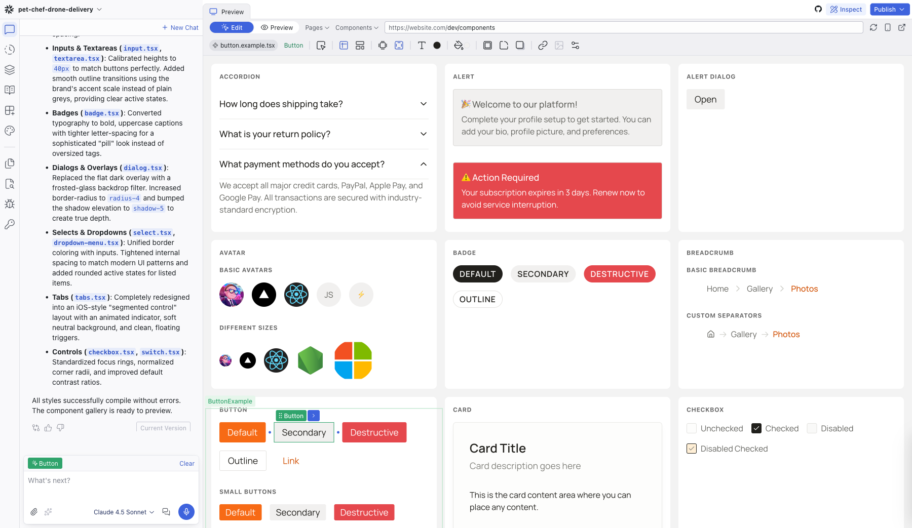
The Component page displays your project's entire design system as a live gallery of components, so you can browse and edit them in one place.
The Component page displays your project's entire design system as a live gallery of components. Open it by clicking Components in the top bar, next to Pages. The button only appears if your project has a component gallery route defined.
What It Shows
The page renders every component in your project with its variants and states. Each component appears in its own card with a label — buttons show their Default, Secondary, and Destructive variants; checkboxes show Unchecked, Checked, and Disabled states; and so on.
This gives you a bird's-eye view of your design system without navigating through individual pages to find each component.
Editing Components
Select any component on the page to edit it directly. Your changes apply everywhere that component is used across the project. The Editing Toolbar appears as usual, so you can adjust colors, typography, spacing, and other visual properties.
You can also use the Chat panel to make broader changes — for example, asking the AI to update all buttons to use a new border radius or to restyle your card components.
When to Use It
- Design system review — check that all components look consistent with your theme
- Bulk styling — select a component and update its appearance project-wide
- Component inventory — see what components exist in your project at a glance
How .example.tsx Files Work
If the Component page doesn't show the variants and states you expect for a component, you can control what appears by adding an .example.tsx file. These files define which prop configurations the gallery renders, without applying any styles of their own.
The Editor finds example files automatically and shows them on the Component page.
Guidelines
- Default export: Export a single component that renders the entire demonstration.
- Organization: Use the
Sectioncomponent (imported from@dazl/component-gallery) to group variants. - Layout: Use
<Section layout="row" | "column">to control item alignment. - Headings: Use
<Section.Title>to label each group.
Example File Template
import { Section } from "@dazl/component-gallery";
import { Button } from "./button";

export default function ButtonExample() {
  return (
    <>
      <Section layout="row">
        <Section.Title>Variants</Section.Title>
        <Button variant="primary">Primary</Button>
        <Button variant="secondary">Secondary</Button>
        <Button variant="ghost">Ghost</Button>
      </Section>

      <Section layout="column">
        <Section.Title>Sizes</Section.Title>
        <Button size="sm">Small</Button>
        <Button size="md">Medium</Button>
        <Button size="lg">Large</Button>
      </Section>
    </>
  );
}
Related Articles
- Theme – manage color tokens and typography scales
- Working with the Theme – guide to customizing your design system
- Visual Editing – selecting and editing elements directly
Theme
The Theme panel manages your project's design system: semantic color tokens and typography scales that apply consistently across every component. It has two tabs, Color and Typography.
Files
The Files panel is a file tree explorer showing every file and folder in your project. Click any file to open it as a tab in the center area's code editor.