Theme
The Theme panel manages your project's design system: semantic color tokens and typography scales that apply consistently across every component. It has two tabs, Color and Typography.
The Theme panel manages your project's design system: semantic color tokens and typography scales that apply consistently across every component. It has two tabs, Color and Typography.
Color
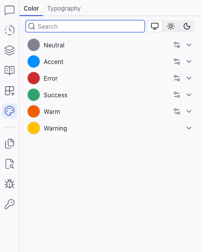
The Color tab organizes colors into semantic groups. A typical project includes groups like:
- Neutral – backgrounds, text, borders
- Accent – brand color, interactive elements, highlights
- Error – error states, destructive actions
- Success – confirmation, positive states
- Warm – warm accent tones
- Warning – caution states
Your project may have fewer groups, more groups, or different names depending on what the AI generates.
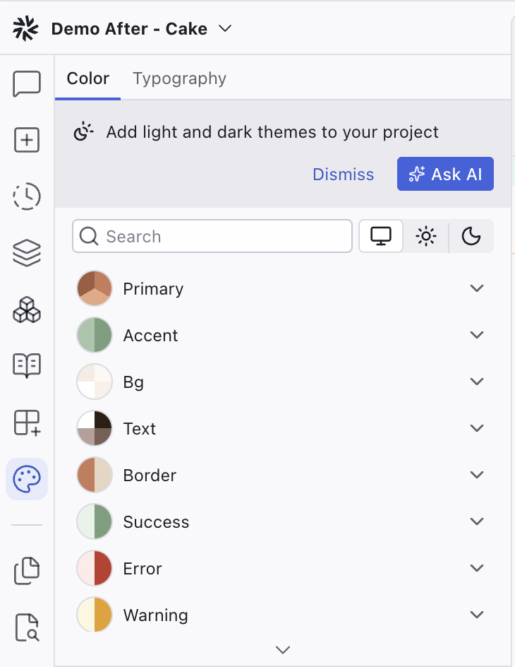
A search box at the top lets you filter color groups by name. Below it, the System / Light / Dark toggle previews your colors in different modes. If your project only supports one color scheme, a callout suggests adding the other — the AI can generate the missing theme for you.
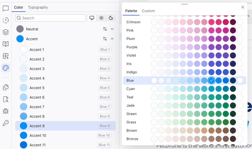
Color Scales
Click any group to expand it and see 12 graded colors plus a Contrast swatch (a white or black that pairs well with the group's colors). Each step maps to a CSS custom property named after the base color. For example, an accent group based on blue uses --blue-1 through --blue-12 plus --blue-contrast.
Lighter steps (1–4) are typically used for backgrounds, mid steps (5–8) for borders and secondary elements, and darker steps (9–12) for text and primary elements. The Contrast swatch is designed to look good against color 9, the highest chroma color in the palette, useful for text on buttons and other high-contrast surfaces.
Changing Brand Colors
Click the controls icon next to a color group name to open a popup with a grid of base colors. Pick one and Dazl regenerates the entire 12-step scale automatically, keeping the relationships between shades consistent.
Typography
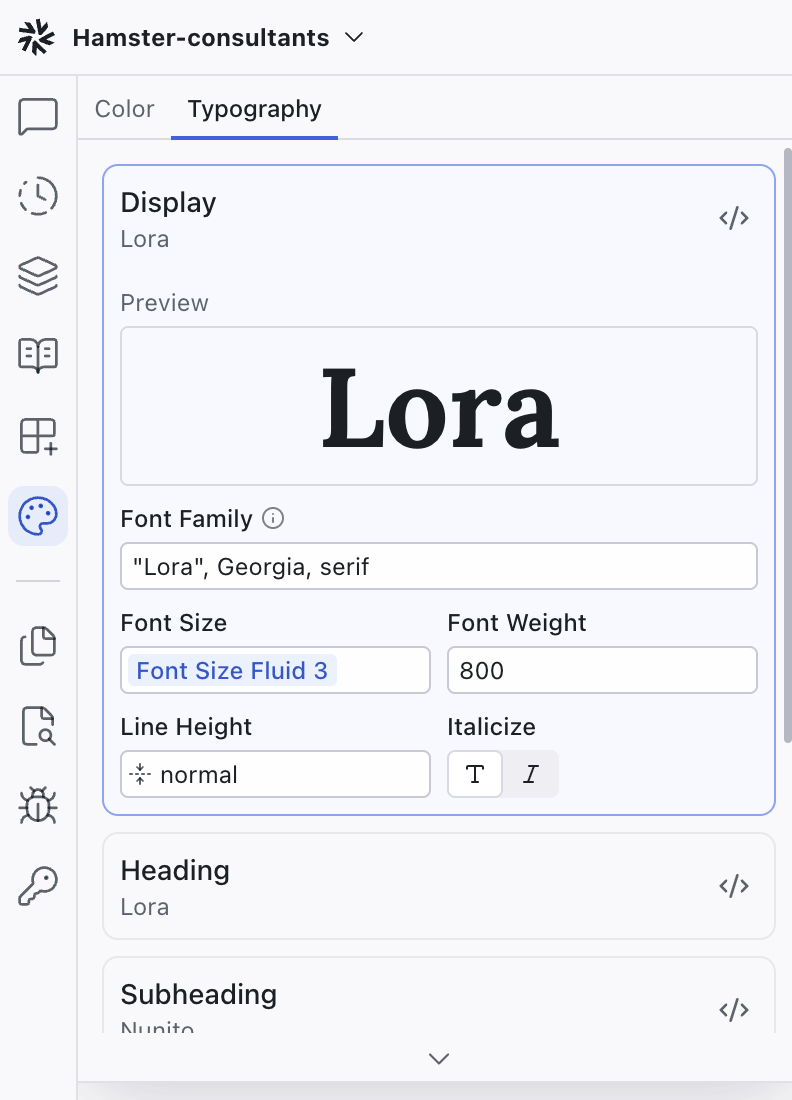
The Typography tab shows six type scales:
- Display – large, prominent text (hero headlines)
- Heading – section headings
- Subheading – secondary headings
- Body – paragraph text
- Caption – small labels and metadata
- Code – monospace text for code snippets
Each scale shows a live preview of the font at its configured size and weight. Click any scale to expand it and adjust its properties: Font Family, Font Size, Font Weight, Line Height, and Italicize. Changes apply everywhere that scale is used across the project.
Font family values are design tokens — changing the font family on a scale updates every component that references it. This keeps typography consistent across your project without editing individual elements.
Related Articles
- Working with the Theme – guide to customizing colors and typography
- The Editing Toolbar – using theme tokens in the toolbar color pickers
Add-ons
Add-ons are pre-built recipes that help install and configure libraries in your project. They live in the Add-ons tab within the Integrations panel, and handle the initial setup steps (installing packages, creating configuration files, adding boilerplate) so you can start using a library without deep technical knowledge.
Component Page
The Component page displays your project's entire design system as a live gallery of components, so you can browse and edit them in one place.