Visual Editing
Edit mode lets you select, move, and modify elements directly on the live preview — no prompts, no code, no credits.
Edit mode lets you select, move, and modify elements directly on the live preview — no prompts, no code, no credits.
Entering Edit Mode
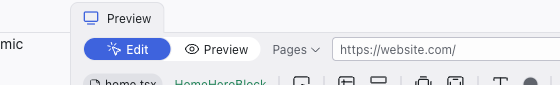
The editor opens in Preview mode by default. Switch to Edit using the toggle in the top bar to start selecting and modifying elements. Switch back to Preview to interact with the app normally (following links, clicking buttons).
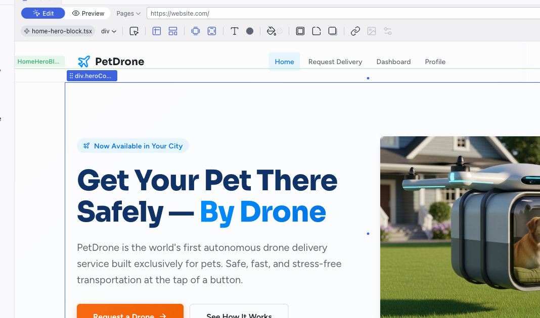
Selecting Elements
Click any element in the preview to select it. A selected element shows:
- Blue outline around the selected element, with drag handles at corners and edges
- Green outline around the parent component
- Breadcrumb label in the top-left of the selection (e.g., "HomeHero...") showing the component name
- Arrow to drill into the component's inner scope
To select nested elements, double-click to drill into a component's inner scope. You can also hold Cmd (Mac) or Ctrl (Windows) and click to select any deeply nested element directly.
Whatever you select is sent to the AI as context, so it knows exactly what you're referring to when you type in the Chat panel.
Editing Text
Double-click any text element to edit it directly. Type your changes and click away to confirm. The change is immediately saved to the source code.
Replacing Images
Double-click any image to open the Media panel in the Editing Toolbar, where you can replace it with a different image.
Text and images can be bound to data expressions, where the same value appears in multiple places. If you edit one and notice other elements changing too, the content is shared. For complex data changes, use the Chat panel instead — the AI can update the underlying data without unintended side effects.
Dragging and Repositioning
Click and drag a selected element to move it. When you release, Dazl updates the layout in the source code. You can reorder items within a container, drag elements into sibling containers within the same scope, or reposition components on the page.
You can also drag images, icons, and HTML elements from the Add Panel directly onto the preview to place them into a component scope. The Add Panel's Elements tab lists standard HTML elements (headings, paragraphs, images, links, and more) organized by category.
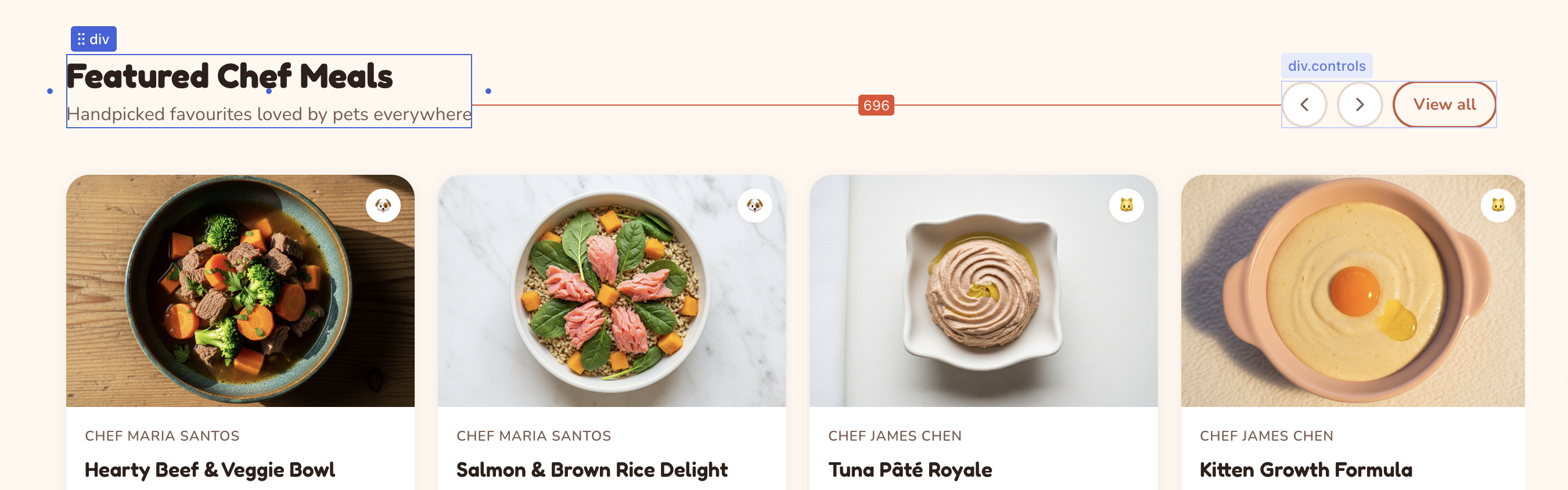
Measuring Distances
Select an element, then hold Alt and hover over another element to see pixel distances between them. Distance lines with labels appear as an overlay, showing the exact spacing in each direction. This is useful for checking alignment and spacing consistency without opening the Inspect panel.
The Editing Toolbar
When an element is selected in Edit mode, the Editing Toolbar appears below the top bar. Each icon opens a panel for a different aspect of the element's appearance:
- Size and position — set width, height, min/max constraints, and CSS positioning
- Layout — choose between box, horizontal/vertical stacks, or grid presets
- Margin and padding — adjust outer and inner spacing with a visual four-sided editor, or drag the handles that appear on the selection frame edges (orange for margin, green for padding). Handles show the original source value (e.g.,
2remor--space-5) as you drag. Hold Alt to edit opposite sides together, or Shift for all sides at once. - Typography — pick from theme font presets, adjust size, weight, alignment, and more
- Text color and background — choose from theme tokens, the full palette, a custom picker, or AI-generated gradients
- Border, corners, shadow — style edges, set border-radius from the theme scale, and add shadow depth
- Link — connect elements to pages, URLs, emails, or phone numbers
- Media — replace images, upload new ones, or generate them with AI
- Properties — edit React component props directly
The toolbar handles the visual properties you can see. For deeper changes — component logic, data flow, or structural refactoring — use the Chat panel to ask the AI.
See Visual Editing in the Feature Reference for a detailed breakdown of every control.
What Happens Under the Hood
Every visual change you make is immediately written to the source code. Dazl's code analysis engine knows which file and which CSS rules are responsible for each element, so it makes precise, targeted edits — not broad rewrites.
When you edit in a mobile viewport (using the Responsive buttons in the top bar), your changes are scoped to that breakpoint through a CSS media query. This means mobile edits only affect the mobile layout and leave the desktop view unchanged.
You can see this in the Chat panel, where visual edits appear as manual edit entries showing exactly what was modified.
Visual editing doesn't consume credits. Use it for any change where you know what you want — adjusting colors, tweaking spacing, repositioning elements. Save AI interactions for changes that require reasoning about structure or logic.
Related Articles
- The Editing Toolbar – guide to using the toolbar effectively
- Visual Editing – full reference for every toolbar control
- Styling Element States – edit hover, focus, and active states
- Chat-Driven Editing – when to use the AI instead of visual editing
- Inspecting Your Project – see the CSS behind your visual edits
Templates
Templates let you save a project as a reusable starting point, so you can run multiple experiments from the same foundation without starting over each time.
The Editing Toolbar
The Editing Toolbar appears below the top bar when you select an element in Edit mode. It gives you direct control over an element's appearance — click any icon to open its panel, make your changes, and the result is immediately visible in the preview and saved to the source code.