The Editor Layout
The Editor is the workspace where you build, edit, and inspect your project. It opens when you click a project from the Dashboard.
The Editor is the workspace where you build, edit, and inspect your project. It opens when you click a project from the Dashboard.
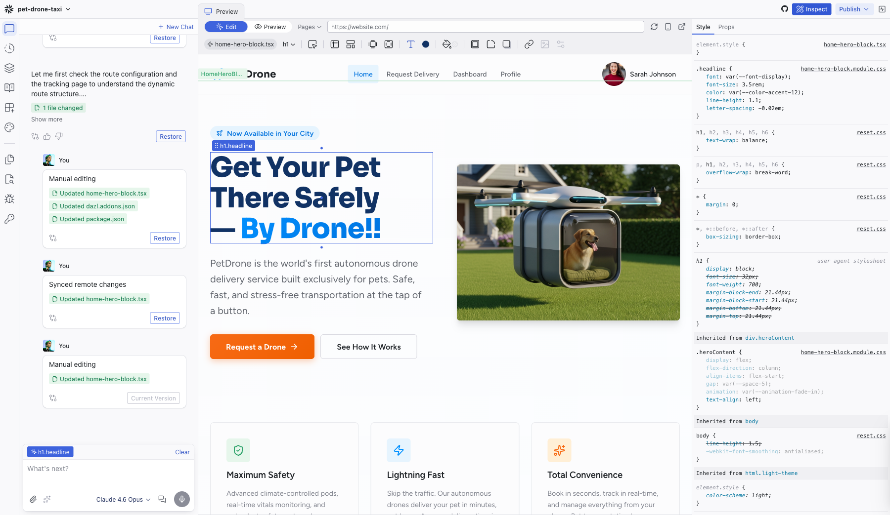
Three-Column Layout
| Area | Description |
|---|---|
| Left sidebar | Tab icons along the edge, with the active panel's content beside them. 11 tabs total. |
| Center area | A tabbed container holding the Preview, code editor tabs, and spec editor tabs. |
| Inspect (optional) | Opens on the right when you click Inspect in the top bar. Shows Style and Props tabs. |
Top Bar
The top bar spans the full width of the editor:
| Element | Location | Description |
|---|---|---|
| Project menu | Top-left | App icon + project name + chevron. Opens the application menu. |
| Edit / Preview toggle | Top-center-left | Segmented control to switch between selecting elements for editing and interacting with the live app. |
| Pages dropdown | Top-center | Navigate between pages and routes in your project. |
| Components | Top-center | Opens the Component page — a live gallery of your project's design system. |
| URL bar | Top-center | Shows a simplified version of the current URL. Click to focus and see the full URL. |
| Reload | Top-center-right | Refreshes the preview. |
| Responsive buttons | Top-center-right | Resize the viewport. |
| Online members | Top-right | Shows avatars of collaborators currently connected to the project. Click to see the full list. |
| Share | Top-right | Opens the Share dialog to invite collaborators by email. |
| GitHub | Top-right | Connect your project to a GitHub repo. Push and pull commits without leaving the editor. |
| Comments | Top-right | Opens the Comments panel for leaving feedback. |
| Inspect | Top-right | Toggles the Inspect panel on the right side. |
| Publish | Top-right | Opens the Publish dialog. |
Left Sidebar Tabs
11 tabs organized into two groups separated by a divider:
Primary tabs: Chat, Add, History, Elements, Specs, Integrations, Theme
Utility tabs: Files, Search, Logs, Keys
Click a tab icon to switch panels. The active panel's content fills the sidebar area.
Center Area Tabs
The center area uses a dynamic-until-pinned tabbing system (similar to VS Code):
- The Preview tab is always available
- Opening a file or spec creates a new tab
- Unpinned tabs (shown in italic) are replaced when you open something else
- Double-click a tab, start typing, or edit its content to pin it (shown in normal text)
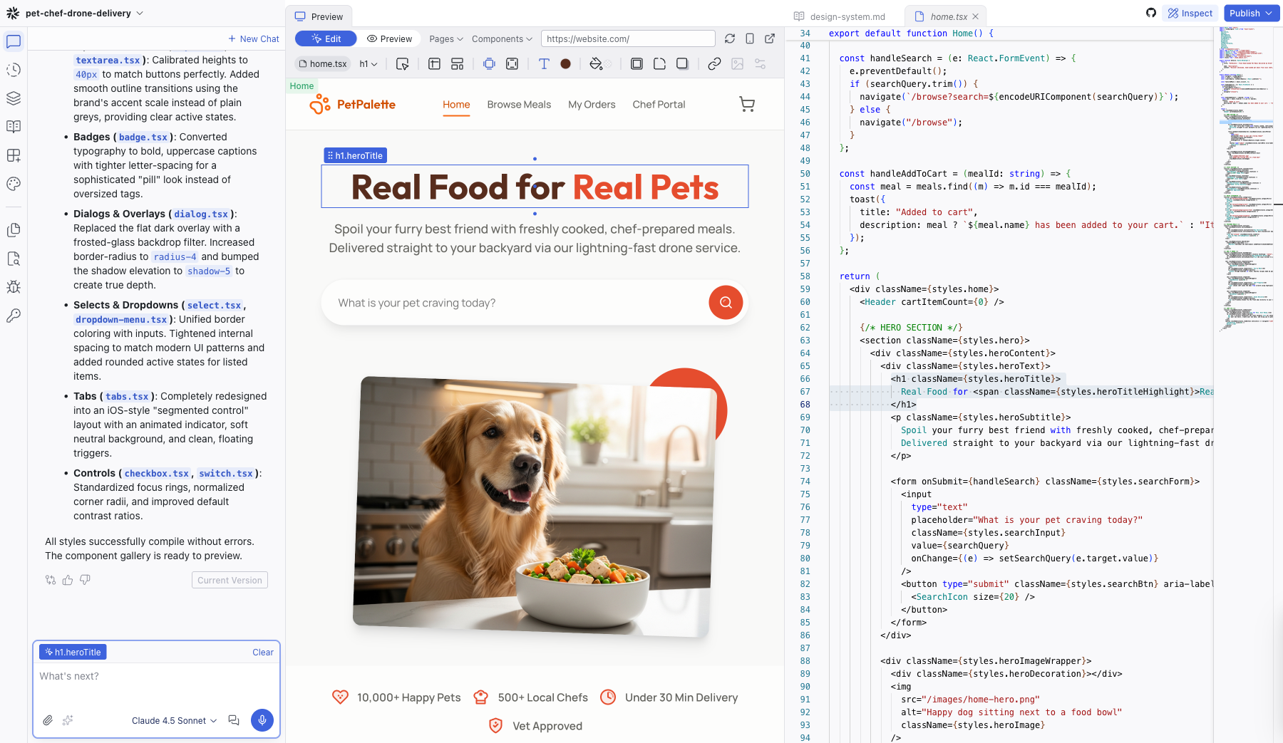
Split-Screen View
Open a code or spec tab alongside the Preview to work in a split-screen layout. The Preview stays on the left while the code editor appears on the right, so you can see changes reflected in real time as you read or edit the source.
Application Menu
Click the project name in the top-left corner to open the application menu:
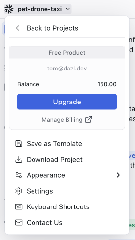
- Back to Projects — return to the Dashboard
- Account section — plan, email, balance, Upgrade, Manage Billing
- Save as Template — save the project as a reusable starting point
- Download Project — download the source code
- Appearance — Light / Dark / System theme for the editor UI
- Settings — project settings
- Keyboard Shortcuts — open the keyboard shortcuts reference (also available via Shift+?)
- Contact Us — support link
The Appearance setting controls the Dazl editor's theme. Your project's theme can be configured separately in the Theme panel, which can override the editor's appearance setting.
Related Articles
- Your First Project – guided tour of the editor
- Chat – the AI conversation panel
- Inspect – the Style and Props inspector
Handing Off to Developers
Once your interactive prototype captures the right experience, the next step is getting it into the hands of your engineering team. Dazl supports several handoff patterns depending on what works best for your team.
Plan
Review and edit a structured project plan before the AI generates code. Define pages, sections, and features upfront.